Friday, April 23, 2010

T-O Map

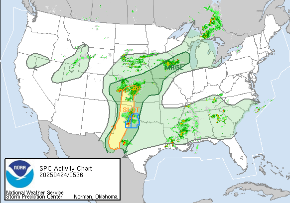
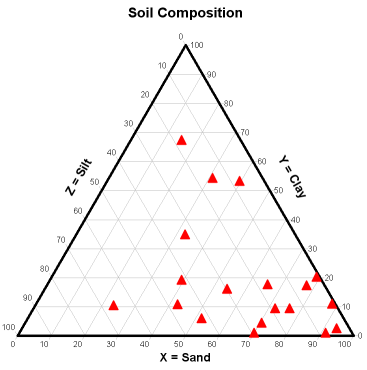
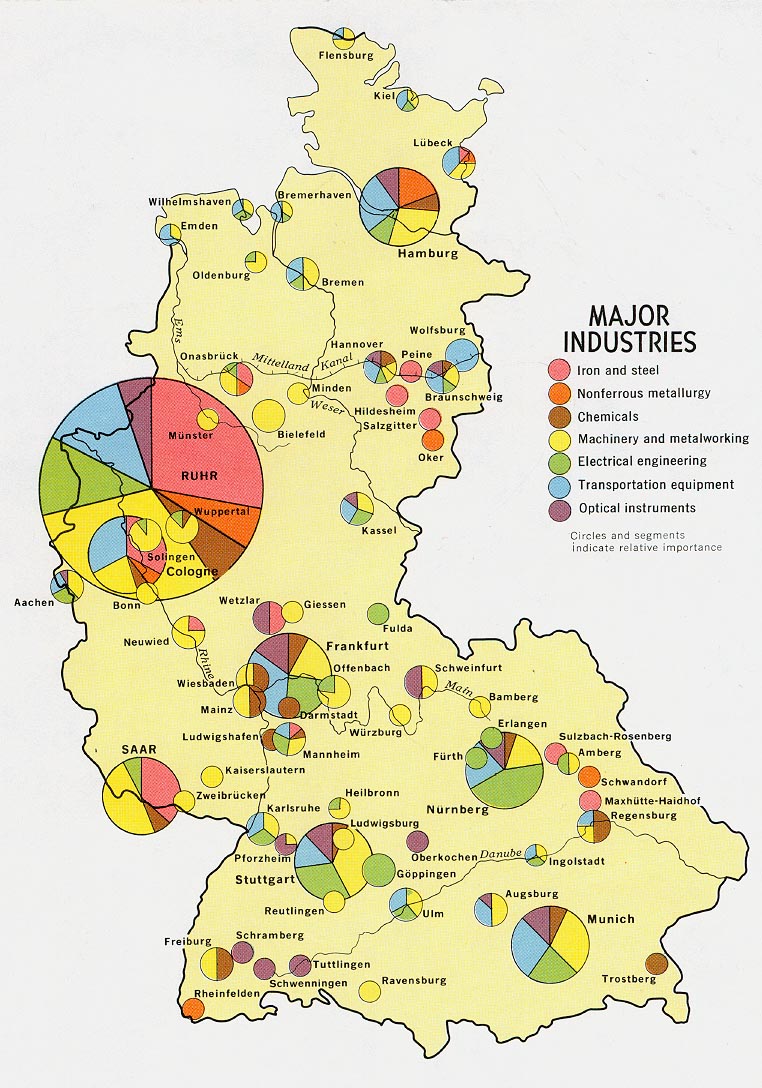
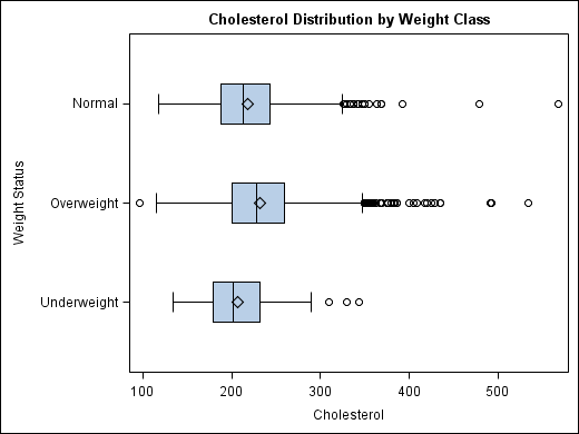
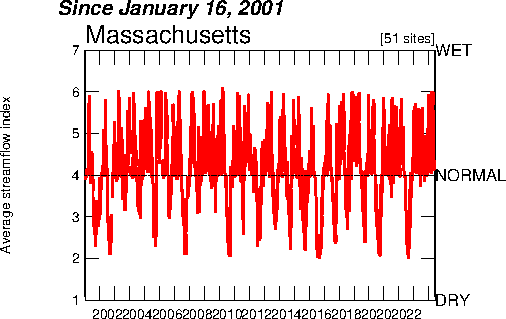
A T-O map is a medieval map, the land is represented as an orb with a T shape division. These maps usually divide the earth into Asia, Africa and Europe. Jerusalem was usually placed in the center of this style of map.
http://en.wikipedia.org/wiki/T_and_O_map

Songlines

The Australian aboriginal art of song lines can be considered a type of map. These song lines come from the aboriginal belief in dreaming, created by the "spirit"and marking routes across the land or sky. This painting is of Red Hill next to Mt.Allen.

http://www.australiadreamingart.com.au/aboriginal_paintings.htm

Unclassed Choropleth Map

A unclassed choropleth map assignes each data value its own category. The Image on the right is an unclassed map, it is easier to see population patterns and eliminates oversimplification.
http://go.owu.edu/~jbkrygie/krygier_html/geog_353/geog_353_lo/geog_353_lo07.html

Bivariate choropleth map

A bivariate choropleth map is a cartographic representation of two different variable and sets of data. This map shows population size of counties in North Carolina and then number of people in poverty within those counties.

http://cartographyexpressions.blogspot.com/

dasymetric map


A dasymetric map is a type of thematic map which uses typographic symbols to spatially classify volumetric data. Dasymetric mapping is useful when you need to refine spatially aggregated data.
http://www.answers.com/topic/dasymetric-map

Univariate Choloropleth Map


A univariate choropleth map with data dealing with only one subject, it examines occurrences of one type of event. This map shows data corresponding to water withdrawals, a single variable, within the United States.

http://www.answers.com/topic/thematic-map-1

Cartographic Animations


Cartographic animations allow the viewer to visualize a process occurring over a set point across time. Animations are a common tool for weather forecasters, they allow for observation of movement and direction of weather phenomena.
http://www.spc.noaa.gov/

Nominal area choropleth map

A nominal choropleth map displays nominal data, the order of the catagories does not matter. The above map shows congressional house wins in and election, the data categories (democrat/republican) do not imply any rank.
http://politicalmaps.org/2008-house-of-representatives-election-maps/

Triangular Plot

This is an example of a Triangular plot, a graph of three variables. The Vertex of the triangles are areas of 100% of the variable. These are commonly used when showing soil composition and other geological forms.
http://www.ccp14.ac.uk/ccp/web-mirrors/dplot/triangle_plot.htm

Thursday, April 22, 2010

Continuously Variable Proportional Circle Map

This is a type of proportional circle map in which the circle size varies in proportion to the size of the variable.
Each circle will have a different circumference based on its data and not on a class.
http://lib.utexas.edu/maps/thematic.html

Star Plot

A star plot is a good way to display data with multiple variables. Each spoke of the star represents a singular variable, its length is relative to its magnitude. Typically star charts are created in multiples, each representing a observation.

http://commons.wikimedia.org/wiki/Category:Star_plots

Correlation Matrix

A correlation matrix is a table of correlations among variables. The numbers describe the degree of relationship between two variable. As you can see in the above correlation matrix the diagonal always has a value of one because a variable always perfectly correlates with itself.
http://www.csub.edu/ssricrem/spss/spss7/ch7.htm

Similarity Matrix

A similarity matrix expresses the similarity between data points. In the matrix the greater the degree of similarity the greater the value of measurement. The matrix above is evaluating similarities in strains of bacteria.
http://www.jbaas.com/articles/vol_2_n2_c7.php

Stem and Leaf plot

A stem and leaf plot is a good alternative o a histogram, it is a visualization of frequencies within classes. The classes are arranged on the left side, while the right side has each individual data point.
http://www.eduplace.com/math/mhm/5/06a/index.html

Box Plot

You may also know these as box and whisker plots, they are depictions of groups of numerical data. Each group is divided into five parts represented by the box and whiskers. The box is divided by the median value, with the top and bottom representing the upper and lower quartiles, the whiskers usually represent the minimum and maximum of a data set.
http://support.sas.com/documentation/cdl/en/grstatproc/61948/HTML/default/a003155605.htm

Histogram

A histogra is a simple graphical depiction of frequencies within classes. Each class is represented as an equal width rectangle, its height is dependent on frequency count.
http://www.statcan.gc.ca/edu/power-pouvoir/ch9/histo/5214822-eng.htm

parallel coordinates graph

The lines in a parallel coordinate graph connect a series of values which are associated with different variables. This type of map is used interactivly in analysis to highlight patterns and comparisions between multiple variables.
http://www-vis.lbl.gov/Events/SC07/Drosophila/

wind rose

A wind rose is typically used by meteorologists to plot the speed and direction of wind in a particular local. The length of the spoke is representative of the frequency of wind blowing from that direction, with the center repenting a frequency of zero.
http://www.maine.gov/dep/air/meteorology/Windrosehome.html

Climeograph

The two most important driving forces behind climate are temperature and precipitation. A climograph is a simple graphical representation of the climate of a particular place, this could be a city, region or continent. The months of the year lie on the horizontal axis, the temperature is shown using a bar graph and the precipitation represented by a line graph.
http://www.washburn.edu/faculty/tfry/Climate%20article.htm

Population Profile

A population profile or pyramid is a display of age and sex for a geographic area. The shape of the profile is representative of the difference between fertility and death rates. This population pyramid signifies high but declining fertility rates.

http://www.coventry.gov.uk/ccm/navigation/community-and-living/coventry-statistics/2001-census-statistics/

Scatter Plot

In a scatter plot, each dot represents a single observation. This plot shows the relationship between elevation and rainfall, a trendline would be drawn to illustrate the negative relationship between the two.
http://staff.argyll.epsb.ca/jreed/math9/strand4/4102.htm

Lorenz Curve

A lorenze curve or accumulation plot is a geovisualization tool that compares the actual distribution of values against a line of equality. The downwards bend in the curve indicates that a small percentage of data points have a large percentage of frequency counts.
http://www.unc.edu/depts/econ/byrns_web/Economicae/Figures/Lorenz.htm

Index Value Plot

A index value plot, plots values against "normal" conditions. This is a good tool for visualization as it gives the viewer and average to compare against. The image above is a index value plot of rainfall, recorded rainfall is compared to a "normal" index value.
http://waterwatch.usgs.gov/?m=pa07d&r=ma&w=pa07a%2Cplot

Bilateral Graph

A bilateral graph is where two related variables that use the same measurements on the x and y axis are both plotted on the same graph. The image above has data for both male and females, with level of shyness on the x-axis and income level on the y-axis.
http://neuropolitics.org/defaultmay06.asp

DOQQ


Digital Ortho Quarter Quads is a computer generated image of an aerial photograph with the displacement and distortion caused by topography and camera angle removed. DOQQs can be produced in different ways by using different types of film.

http://www.crwr.utexas.edu/gis/gishydro00/Class/trmproj/Donnelly/termproject.htm

DEM

Digital elevation model is a digital representation of data in raster form. These images can colorized and rotated to highlight topographic features.

http://oregonexplorer.info/craterlake/dem.html

DLG


A Digital Line Graph (DLG) is a cartographic representation of digital vector data.

http://oregonexplorer.info/craterlake/dlg.html

DRG


A DRG map is a digital raster graphic,raster information is coded in pixels, using a coordinate system. The image above is a scanned image of a USGS topographic map.


http://egsc.usgs.gov/isb/pubs/factsheets/fs08801.html

Isopleths


Isopleths depict a variable that cannot be measured at a point; the value has to be calculated from an area.This type of contour line is calculated from data values and then assigned to center of the area from which it drew its values to be drawn.

http://www.wbdg.org/resources/env_iaq.php

Isopach


An illustration variation of thickness and extent of a layer or rock or soil, Isopach lines connect points of equal thickness. The image above is of rock thickness on the surface of the moon.

http://www.fas.org/irp/imint/docs/rst/Sect19/Sect19_6.html

Isohyets

Isohyets are continuous lines that connect points that receive equal amounts of rainfall. Isohyets are represented as contour lines on weather maps.

http://www.scoop.co.nz/stories/AK0808/S00090.htm

Isotachs


Isotachs connect areas of equal wind speed, they are a form of isoline. The spacing of the lines is relative to intensity of the wind.

Isobars


Isobars are a form of isolines that join areas of equal pressure. They can be used to predict future weather and are common in weather forecast broadcasts.


http://www.weatheronline.co.nz/reportswxfacts/Isobars-on-surface-maps.htm

LIDAR


LIDAR is a remote sensing technology that uses scattered light to determine the rage of a distant target. This is used to detect changes in topography.

http://www.noaanews.noaa.gov/stories/s798.htm

Doppler Radar


Doppler radar creates images by beaming a microwave signal and then analyzing the return signal for differences. Differences in frequency can give information on speed and direction of an object. The most common use of Doppler is in weather forecasting where it is used to predict the speed and location of approaching weather phenomena.

http://www.bom.gov.au/weather/radar/about/new_radar_services.shtml

Black and white aerial photo


Black and white aerial photos represent a view of the earth from above. They are not accurate representation of the area , distortion is created when projecting a 3 dimensional object onto a 2 dimensional surface. Land use surveys and habitat analysis are common uses of black and white aerial photography.

http://freegeographytools.com/2007/georeferenced-terraserver-imagery-with-usaphotomaps

Infrared aerial photo


Infrared aerial photography is a photo taken from the air with film sensitive to infrared light. Different physical landforms reflect different levels of infrared light and enable the viewer to distinguish between them.

http://www.nps.gov/lyjo/naturescience/naturalfeaturesandecosystems.htm

Statistical maps


A statistical map is a representation of a quantity of a variable within a geographic area. It is any map which represents statistics.

http://personalpages.manchester.ac.uk/staff/m.dodge/cybergeography/atlas/census.html

Cartograms


A cartogram is a map in which a variable being mapped defines its own land area. The area of the map is distorted to convey information about the variable being mapped. This map type can give the viewer a more complete understanding of the phenomena being mapped, such as in the above map where US counties are rescaled in accordance to population.

http://en.wikipedia.org/wiki/File:Cartlinearlarge.png

Flow maps


This type of map represents the flow of people ideas, diseases, ect… across space. The flow lines vary in thickness in accordance with volume.

http://www.mundi.net/maps/maps_014/

Isoline maps


This type of map uses isolines (continuous lines) to connect points of equal values. This type of map is common when mapping temperature and altitude.

http://giscommons.org/?page_id=18

Proportional Circle Maps


A proportional circle map represents absolute value data that occurs at a specific point or can be aggregated to points within areas. The circle varies in size according to the proportion of the data values. The above USGS map has circles that are proportional to the width of the channel.

http://pubs.usgs.gov/fs/fs-004-03/

Chloropleth Map


A chloropleth map is a type of thematic map; it shows a specific set of data using a color scheme. These maps are used when defined regions are important as they do not define their boundaries.

http://my.ilstu.edu/~jrcarter/Geo204/Choro/Tom/

Dot-distribution Map


In a dot distribution map represents quantitative data as dots. This type of map is good for mapping populations and the above map is a US census map of population. The location and number of dots allows you to infer information about density.

http://www.census.gov/geo/www/mapGallery/2kpopden.html

Propaganda Map


This type of map is created to present the viewer with a visualization of a specific idea, this is usually political. A propaganda map does not have concern for accuracy but rather a focus on getting a point of view across in a effective manner. The above map was created to generate fear of bombing and thus to fortify their position as the non-aggressor.

http://longstreet.typepad.com/thesciencebookstore/2008/08/propaganda-maps.html

Hypsometric map


Hypsometric maps are maps that show elevation by contour using bands of color. The bands of color represent different elevations and usually follow the scheme of darker colors for lower elevations and lighter colors for higher elevations, with gradient between.

http://www.reliefshading.com/colors/hypsometric.html

Cadastral Map


A Cadastral map shows the boundaries of land parcels, this is usually a legal map to denote ownership and boundaries. These maps can also include many details about the land, including tax rates and zoning.

http://commons.wikimedia.org/wiki/File:Cadastral_map_of_Brno.svg

Wednesday, April 21, 2010

Topographic Map

This is a topographic map which is easily recognized by its detail and representation of relief using contour lines. A topographic map is a detailed and accurate representation of features on the ground. The contour lines represent the interaction of the surface with the horizontal planes, allowing the reader to distinguish gradient.

http://vulcan.wr.usgs.gov/Volcanoes/CraterLake/Maps/map_crater_lake_topo.html